E-COMMERCE SITES, THE WINNER IS WHOEVER OFFERS THE BEST USER EXPERIENCE IN THE MESSY MIDDLE
Today the game is played above all in the mobile world, and the fate of the match is decided in a few seconds in the central phase of the purchase path, which is the most confused and dangerous one. Here’s how to get ready and why.

The crucial moment of the purchase
A recent Google study has thoroughly investigated the central moment of a customer’s purchase journey and the first discovery made – with all due respect to many marketing and advertising wizards who profess absolute, as well as theoretical truths – is that the path it is not linear at all, nor completely intelligible. Far from it.
The Trigger: the start of the sales funnel
The initial moment of the purchase process – which is the so-called trigger, the spark that sets the entire sales funnel in motion up to the final click and that will lead it to opt between one solution and another, the path that the (potential) customer it will accomplish – is not just long, but also absolutely tortuous and full of pitfalls.
It is in that middle phase, especially on mobile, that brands in general and even more so e-commerce sites are playing the game. This has a double implication: growth in turnover and the effectiveness of conversion campaigns.

Trends in e-commerce keep changing very fast. Some of them may be just passing fads, while others can act as a seismic shift for the entire industry. Online or mobile shopping falls into the latter category.
Today, customers have become more demanding than ever. An analysis conducted by Adobe’s User Experience has revealed that 38% of online shoppers will leave a website if they find the design unattractive. And that’s why companies are working so hard to create clean and easy to navigate websites in order to make the buying process as intuitive as possible.
(https://www.bigcommerce.com/blog/ecommerce-ux/#how-to-stay-ahead-of-user-expectations)
Not being ready at that moment means losing sales opportunities and wasting the investment made. This middle phase is called “messy middle“, in which the two protagonists of the affair, those who sell and those who want to buy, can get lost and never meet again. The seasonality, the price, the contents of the website and above all the customer’s UX play a decisive role, especially for a medium and large e-commerce site. User experience is in turn influenced by the page loading speed.
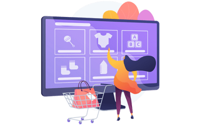
What is User Experience for e-commerce?
User experience is defined as the set of elements concerning the interactions of an individual with a company, as well as the related products and services. It also refers to perceptions, attitudes and private emotions experienced before, during and after the interactions.
Likewise, e-commerce user experience is defined as the overall user experience after interacting with your e-commerce site.

It’s about how visitors feel when they walk through your online store and how easy it is for them to perform a desired action.
We can therefore deduce how UX is basically something subjective. Donald Norman, an US engineer who specialized in cognitive sciences, states that user experience is basically about “the way you live your life, the service in question, and obviously, how an application or a computer system is used”
(https://makewebbetter.com/blog/ecommerce-user-experience/)
The battle of the messy middle
But what is that middle ground and what happens to it? It’s quite simple. That’s in fact the arena of confrontation between you and your competitors, which is subject to two sharp and inexorable words from customers: better and cheaper. To complicate matters, the fact that today the word “best” is more sought than “economic”. As a matter of fact, if “economic” is a variable and personal concept, in the end it only has one meaning: not expensive, less expensive.
And what does “best” mean? This word has an infinite number of meanings, all influenced by a series of cognitive biases that have a great impact on the customer’s prospect in his exploration activity – in search of the best-cheapest product – and on his evaluation of what is best and cheapest for him.

These biases are:
- The essential information to describe the product, in order to make the purchase decision simpler and more immediate (the so-called category heuristic);
- The correlation between waiting time to get the product and the desire to buy it: the longer you have to wait, the less desire you have to actually get it (power of immediacy);
- The experiences and comments of previous clients (social proof);
- Limited availability: the less there is, the more you want (scarcity bias);
- The tendency to mostly follow the reviews or comments of experts or referenced people (authority bias);
- A gift accompanying the purchase favors the purchase (power of gratuitousness).
It is really important to take one thing into account and to remember the Google team research. All the above is a really difficult process for those who do business, but not for the customer: as a matter of fact, it is normal for a user to act like this, as he perceives his customer journey on mobile devices as an unavoidable experience. The duty of an e-commerce website or a brand is to stand by the user and to be ready at the right time, helping him to make his decision while never forcing it.
Conversion is guided by e-commerce UX
According to Amazon CEO Jeff Bezos, if you can build a great user experience, customers will talk to each other. Word-of-mouth is a very powerful tool that should never be underestimated.
UX design plays a vital role in the success or failure of any e-commerce business, and it’s not just limited to aesthetics.
From logic and accurate transitions to simple and clear micro-interactions, fast feedback from the system, attractive product presentation, easy checkout flow and a bunch of intuitive features; every single one of these aspects can directly or indirectly affect your e-commerce game.
Some of the basic but crucial factors you should take into account are:
- Operational simplicity.
- Design that does not overshadow the e-commerce website.
- Product promotion.
- User data security.
- Appropriate visual elements such as menus and catalogs.
(https://www.bigcommerce.com/blog/ecommerce-ux/#how-to-stay-ahead-of-user-expectations)

How to keep user expectations
“The key is to set realistic expectations for customers and then not just meet them, but exceed them – preferably in unexpected and useful ways.” – Sir Richard Branson.
It is important to always keep in mind that the competition can outperform your e-commerce if you ignore some aspects that can be really valuable to your business. Your competitors can in fact be identified by conducting a simple Google search, so it won’t be a problem for the customers to switch brand and to look for a better and easier way to comply their needs.
Also, in the current scenario, customers often act as brand advocates by extensively promoting the products and services they purchased. For this reason, it’s important to establish an action plan aimed at defining the best areas to act with the goal to improve UX.
Best, cheaper… and fastest
Let’s have a look on which areas it’s important to act. Even though both things are crucial, the second one ends up prevailing over the first. In fact, it is necessary to work on:
- The website content with texts, images, infographics and anything else that can differentiate your proposal and make it attractive, beyond pure branding;
- Performance and site indexing, so that contents are quickly and easily accessible, by shortening the journey between trigger and purchase and by reducing the customer’s exposure to competitors’ proposals.
In other words, a slow website or one with a bad Google rank (for which speed is in turn a rewarding factor) can ruin any content, campaign, brand or product, regardless of their quality and reputation. That means that:
it is not enough to be better and cheaper if you are not faster, if not the fastest.

Especially during peak periods such as those that occurred several times during 2020 due to the pandemic, or those typical of Christmas holidays and Black Friday. As a matter of fact, several studies indicate that the loss of a second of speed leads to up to 10% less conversions, while Google team always reports that while 95% of users would return to a fast site, only 62% would repeat the experience on a slow web site.
That means that the immediacy of use even beats content and offers, which always risk of not being seen due to the slowness of the site.
The point is that a larger and more articulated a website, the more pressing become the needs in terms of adequate architecture, up-to-date systems and performance. This way it is also obviously easier to lose control. So, what is the best way to solve the problem without hanging a work in progress sign on the website or facing invasive, risky and expensive interventions? An easy to install layer like iSmartFrame, which is intended to avoid interventions on the website structure, could be a really smart way to solve the problem and to turn the website back to its maximum speed.
This will have a positive impact on every factor that affects the visibility of the site’s content, such as indexing and UX. Two really important factors which are completely independent of the original complexity of the website, and which, on the contrary, contribute to increasing its functionality and effectiveness.
In short, it’s in the middle way between server and end user, where iSmartFrame acts, that the messy battle is won, and that’s exactly in the customer journey where speed is turned from a source of pitfalls to a great opportunity.
Insights
News, studies and research on the world of Business Performance. Aimed at managers and staff of companies interested in the growth potential that Digital offers.
User experience: why it is increasingly crucial for the success of an e-commerce
Do you know the first rule for e-commerce? Here it is: “if users can’t find a product, they cannot even buy it”. Full stop. And breaking this simple rule is easy, even without knowing it. You only need an item poorly displayed in the digital showcase, described with insufficient information or hard to reach due to a slow website, to blow up even the most refined branding, marketing and communication strategies.
Conversion rate optimisation (CRO) for ecommerce: the steps to follow
An e-commerce can be called successful if it returns a good proportion between products sold and visits recorded. In this article we will understand how a website can be improved and how to achieve satisfactory results through an effective optimisation strategy.
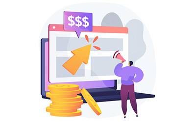
Making Money? It Only Takes a Tenth of a Second
Here’s why increasing the loading speed of your website even by just a tenth of a second can make a difference of up to 10% when it comes to online sales. Research from business intelligence experts is very clear: user experience on smartphones is worth more than the actual product and brand.
Master Core Web Vitals and boost your business
To configure the platform we need information and technical specifications.
Set a call to learn more